
Products: Painted Weave, Painted Zigzag, Color Blocks, Color Shapes, Gradient Lines, Brush Fade, Pencil Stripe, Check I, Fading Shapes, Harmonica, Brush Stripe, Tint, Tunnel
Brit Van Nerven
The Studio Brit van Nerven is a studio specializing in product, material, and exhibition design. Brit van Nerven (born July 13, 1983, in Uden, Netherlands) graduated in 2011 from the Design Academy Eindhoven and founded her studio in 2012, where she and her team work on both accredited and independent projects.
Her work explores the relationship between form, color, and space viewed through a contemporary social context. This translates her narrative way of thinking into an abstract language and demonstrates a strong dialogue between trends and product design. In fact, she focuses on the tension between craftsmanship and industrial manufacturing, aiming to experimentally discover new possibilities for materials and techniques. Brit uses various tools, such as photography, film, and graphic design, to tell the entire story.
 vanbrit.com
PAINTED WEAVE

PAINTED ZIGZAG

COLOR BLOCKS

COLOR SHAPES

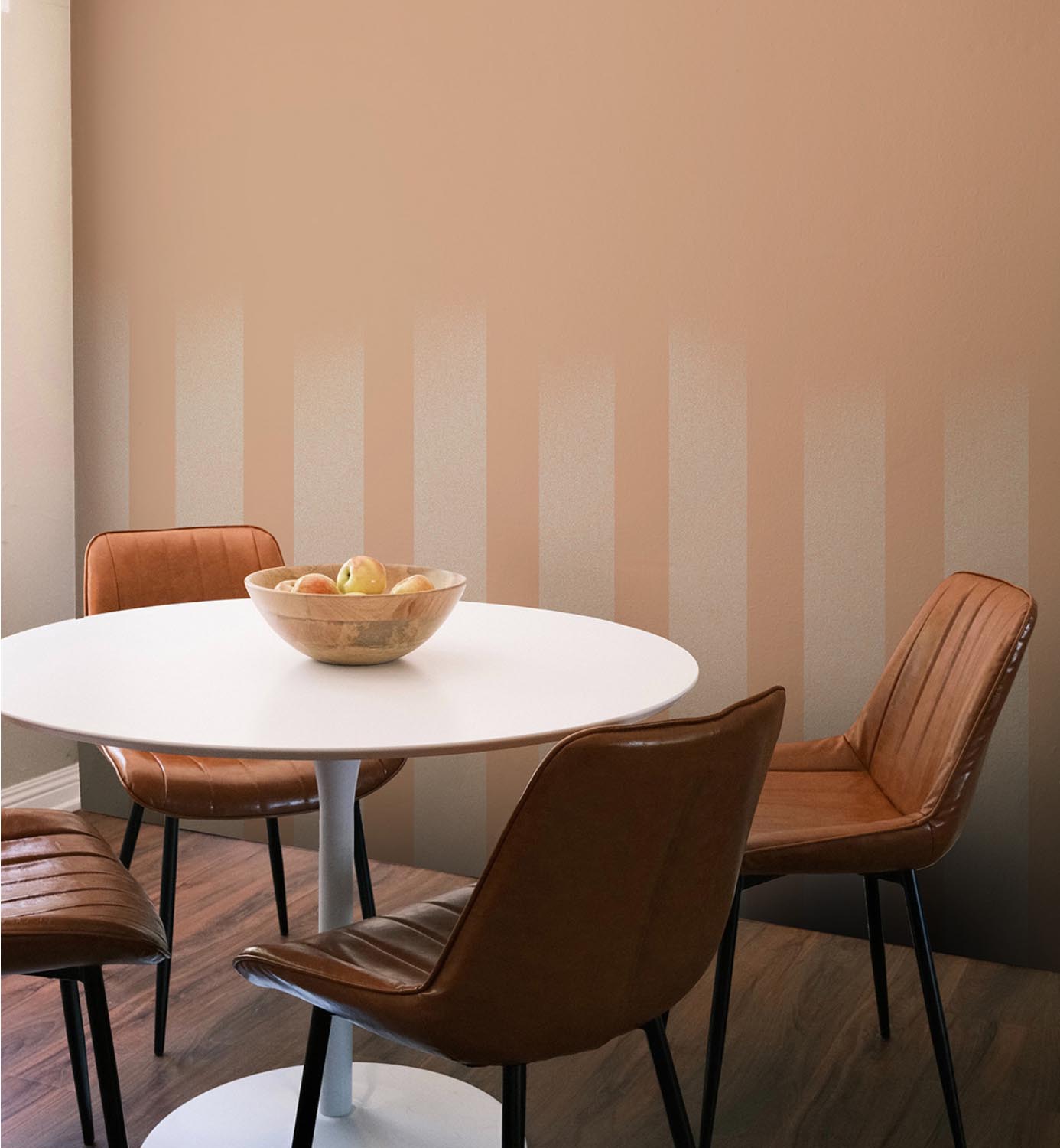
GRADIENT LINES

BRUSH FADE
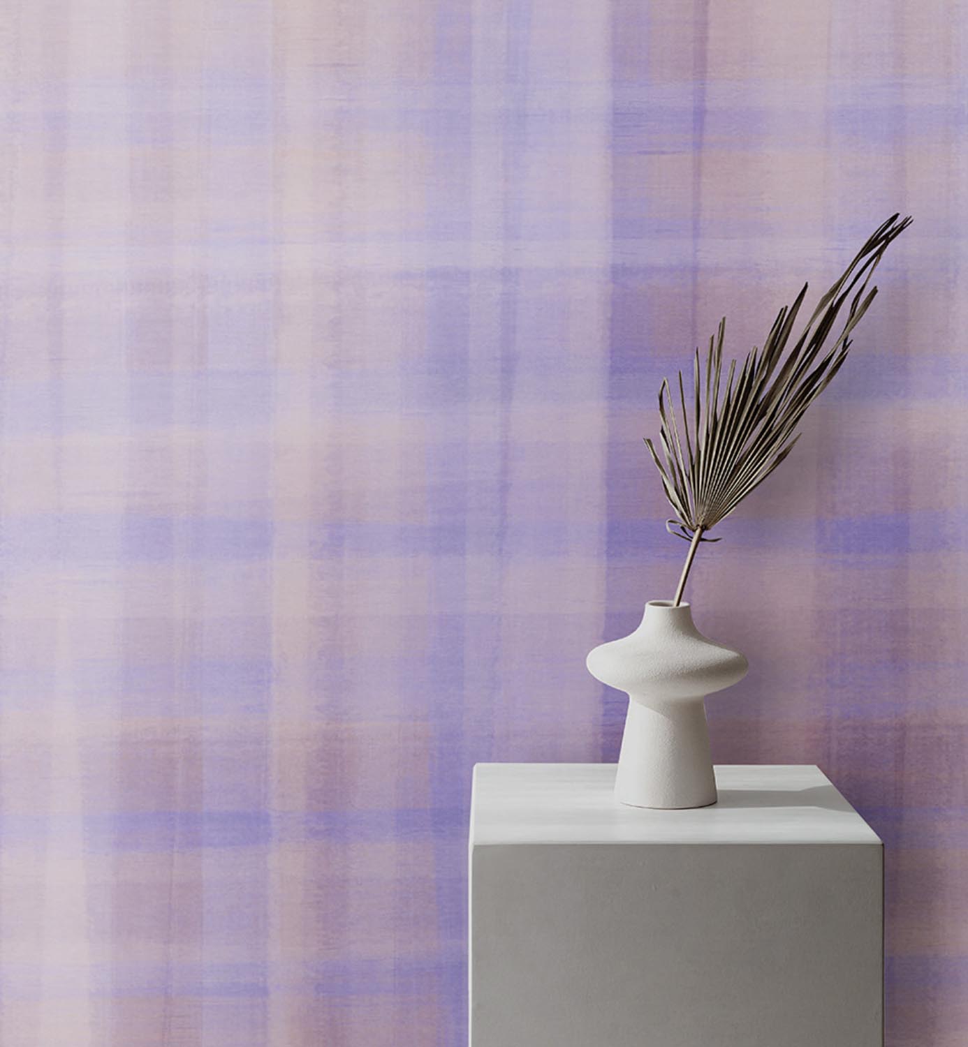
CHECK I
FADING SHAPES I

FADING SHAPES II

HARMONICA

TINT I

TUNNEL I

BRUSH STRIPE

TINT III

PENCIL STRIPE I

PENCIL STRIPE II

PENCIL STRIPE III

TUNNEL II


